I just posted about this paper and I realised there is a simpler way to poke a hole in it.
The paper says
We define the dependent variable as the daily difference in the natural log of the number of confirmed cases, which approximates the daily growth rate of infections
and then defines a linear model for g. The details of the model are not important, let's just assume that nothing changes at all. What happens if we let the epidemic play out with a fixed g?
The important point is that they have used the cumulative confirmed case numbers. So let Cn be the cumulative daily totals of cases. Then
g = ln(Cn+1) - ln(Cn)
g = ln(Cn+1/Cn)
eg = Cn+1/Cn
Cn+1 = egCn
So their model for COVID19 with everything else held fixed, gives exonential growth directly in Cn. This is actually OK if the growth initial rate never changes but of course the whole point of this paper is to study changes in growth rate. Cn+1 is just Cn plus tomorrow's new cases. That depends only the reproductive rate of the virus and how many cases there were about a week ago. How many cases there were a few weeks or months ago has no place in the calculation. This is clearly not a valid model.
This is a much simpler way to see the flaw in the paper but unlike my earlier post, it doesn't give any insight into how this error skews the results in favour of earlier interventions.
I ran across a paper by Eran Bendavid, Christopher Oh, Jay Bhattacharya and John P. A. Ioannidis. It looks at the impact of non-pharmacological interventions (NPIs) on the growth of COVID19 cases. It finds that less restrictive NPIs (lrNPIs) have good effects while more restrictive NPIs (mrNPIs) have no clear beneficial effect. This is a very surprising result.
I’m going to say up-front that I am neither an epidemiologist nor someone who works with this kind of data regularly. If I’ve missed something obvious or subtle, I would love to know about it.
TL;DR
This paper seems wrong. This paper takes an odd definition of case growth, one that will exaggerate the impact of NPIs that occur earlier and lessen the impact of later NPIs. Since almost every country starts with lrNPIs and then moves to mrNPIs later, the result of applying this methodology is that lrNPIs come out looking more effective than mrNPIs.
If you read the text of the paper the definition of growth seems standard. It’s the logarithm of the ratio of cases from one day to the next. However if you read the supplied source code, you find that it’s actually the ratio of cumulative cases. That is a very important difference and that is not made clear in the text of the paper. This statistic is not linear in the rate of transmission and running linear regression on this to measure the impact of NPIs does not seem superior to more usual ways of estimating growth, in fact it doesn’t seem valid at all.
Details
This paper has quite a remarkable finding. How could it be that forcing people to stay in their houses has no measurable impact on transmission while asking people to social distance does? It’s counter-intuitive but of course that’s what makes this worth publishing. And here it is published in a peer reviewed journal but I still couldn’t believe it.
So I looked for rebuttals of the paper. I found this, where the authors respond to several criticisms. Unfortunately the original letters are pay-walled. In the response to the letters, I found this surprising paragraph.
Fuchs worries about omitting the period of declining daily case numbers, but this is a misunderstanding. We measure growth of cumulative cases, which are monotonically increasing, and therefore never go below 0 (negative growth) in our study’s figure 1 (“Growth rate in cases for study countries”). The data that we include cover the period up to the elimination of rapid growth in the first wave (Figure 1).
Growth in cumulative cases? That’s an odd choice. Is this a error? The paper includes source code in a zip file. I uploaded it to a GitHub repo. You can see in the source for the Spain calculations
gen l_cum_confirmed_cases = log(cum_confirmed_cases)lab var l_cum_confirmed_cases "log(cum_confirmed_cases)"gen D_l_cum_confirmed_cases = D.l_cum_confirmed_caseslab var D_l_cum_confirmed_cases "change in log(cum_confirmed_cases)"...reghdfe D_l_cum_confirmed_cases p_esp_*, absorb(i.adm1_id i.dow, savefe) cluster(t) resid
There’s no error. They used delta(log(cumulative)).
Now look at what they wrote in the paper.
We define the dependent variable as the daily difference in the natural log of the number of confirmed cases, which approximates the daily growth rate of infections (g). We then estimate the following linear models:
No mention of “cumulative”. The paper is not inaccurate but it is ambiguous. This ambiguity is resolved in the code in a way that is surprising and that also happens to favour finding lrNPIs vs mrNPIs.
The usual thing to do is to take either “ratio of cases day by day” or “logarithm of cases day by day”. Logarithms are useful because they turn exponential growth into straight lines and we have lots of tools for dealing with things that behave like straight lines - specifically linear regressions
So we have delta(log(daily)) (common) and delta(log(cumulative)) (this paper). They are similar and the paper was not explicit about which one was used, so I supposed the reviewers of the paper just assumed it was delta(log(daily)). The problem is that they are hugely different. This should have been made explicit in the text of the paper.
The Problem with delta(log(cumulative))
So what’s the difference between delta(log(daily)) and delta(log(cumulative))?
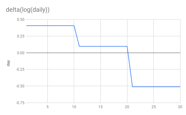
Let’s simulate an epidemic. I’m not going to use an SIR model. I’m just going to simulate exponential growth/decay. 10 days at 1.5x per day, another 10 at 1.1x and finally 10 at 0.6x This simulates steady growth, followed by a weak NPI reducing g from 1.5->1.1 and then a stronger NPI reducing g from 1.1 to 0.6. Whether you think additively or multiplicatively the second NPI is stronger
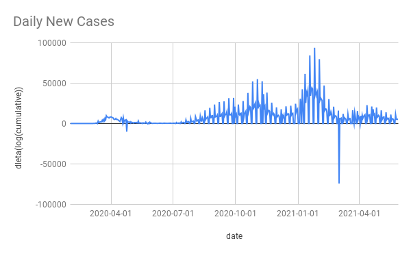
Here’s are the basic graphs showing daily new cases and cumulative cases. Nothing terribly interesting here although I would point out that the NPIs are far more clearly visible to the human eye on the daily graph than on the cumulative graph.
Now let’s look at log(delta(cumulative)) vs delta(log(cumulative)).
You can see that delta(log(daily)) gives us a flat line during periods of constant growth. This is exactly what we want and perfect for applying linear regression. delta(log(cumulative)) on the other hand gives us… I don’t know what. It’s dropping rapidly, even when cases are still rising! It’s not linear at all despite periods of constant growth. Applying linear regression to this seems unjustified, to put it mildly.
More importantly you can see that the later NPI is very clearly stronger in the delta(log(daily)) graph and applying linear regression will discover that. While in the delta(log(cumulative)) growth, it’s the weaker NPI which appears to have a larger impact!
Finally and most absurdly, if a perfect NPI appears in week 3 and stops transmission dead in its tracks, delta(log(cumulative)) would drop from from 0.2 to 0. So this perfect NPI would still appear less effective than the first 1.5x->1.1x NPI!
This definition of g is fundementally broken.
The authors themselves state that g is bounded by zero. So they know about this. If you look at the graphs in their paper you can see this effect quite clearly, they all head to 0 as time goes on.
Per-country growth from the paper
Contrast this with graphs of estimated R for the 10 countries in the paper.
At the end of the period (around 2020-04-10), UK, US, Sweden and Netherlands all still had positive growth rates but in the paper’s graphs, they are all hanging around close to 0.
This should have been a huge red-flag for the authors that something was up with their methodology.
Further oddness
This paper was published in 2021-01 but only looks at data until 2020-04. The zip file that comes with the paper contains data for cases and NPIs far beyond 2020-04. Why don’t they use more data? Wouldn’t more data give a clearer result? There is no justification given for the stopping point. The nearest is this statement in their reply to letters.
The data that we include cover the period up to the elimination of rapid growth in the first wave.
More data would certainly have made it very obvious that the delta(log(cumulative)) has some very odd behaviour. The graphs of “growth” would have stayed around 0 even as Spain, France and Netherlands headed into new waves.
For example here’s Spain’s daily cases and delta(log(cumulative)) (the data comes from the paper’s ZIP file it has some blips and squeaks that I didn’t bother to try clean up).
The massive winter wave is almost invisible with delta(log(cumulative)). As is pretty much everything else except the initial wave. This shows what a non-useful method it is to take delta(log(cumulative)).
Conclusion
When the methodology gets the wrong answer on simulated, perfect, noiseless data, something is wrong. When the methodology is surprising and the surprise is not even mentioned, let-alone justified in the paper or validate on well-understood cases, it’s alarming.
It’s possible I have missed some key point about delta(log(cumulative)) that makes it suitable for use or superior to log(daily). As far as I can see, the only “good” thing about it is that it gets the answer that the authors wanted.
I don’t have access to the software needed to run their code (Stata is expensive and I have no use for it day to day). If I did I would try 2 things
create some fake countries with simulated growth and simulated NPIs and apply the paper’s code to see if it gets the wrong answers
fix their code to measure growth correctly and run it all again to see how the results change. I suspect it would come out quite differently.
As it stands, the conclusions drawn by this paper don’t seem to be justified at all.
Japan’s National Institute for Infectious Diseases published an epidemiological investigation showing long range airborne transmission on a plane. It occurred in Mar 2020. It was published in Oct 2020, in Japanese only. Google translate makes it pretty readable.
Main takeaways:
started off following the “2 row rule” but after finding a bunch of infections near the index case they expanded and expanded and eventually tested 122 out of 141 passengers.
found 14 PCR positive passengers.
found several others with symptoms who they did not test.
confirmed that all positives were an RNA match for the index case.
it travelled far - furthest infection was 16 rows in front of index case with another 4 infections 9 rows in front and one 6 rows behind. Also, some of the symptomatic, untested people were far from the index case.
index case had a severe cough but did not wear a mask
I have translated the seating diagram published in the report from Japanese to English. I don’t know why there are 2 “3rd tests”, that was in the original Japanese.
Seating diagram of flight with test results etc
In the discussion they mention droplet and “マイクロ飛沫感染” - micro-droplet - infection in-flight. They also say that they didn’t have aircondtioning and ventilation information or pre-boarding passenger interaction information.
I often hear that “Japan understood this was airborne from the start” and it’s half true - some scientists here knew and the “3 Cs” guidance has been good but a lot of the response has been focused on droplets and fomites, cleaning and perpex barriers.
All of the information in this report was available in March 2020. It’s really disappointing that this was not published sooner and more broadly as it seems like it would have been strong evidence for airborne spread and also strong evidence against the safety of air travel. Especially given the full RNA analysis and almost complete test coverage os passengers