A friend of mine has been playing with simple models of the spread of SARS2 in Japan since the beginning. It was always interesting but nothing mind-blowing. Recently he added vaccination into it and things got very interesting.
This thread will cover implications of the model and speculation about Japan’s future epidemic the technical details of the model speculation about why such a simple model is so good (in Japan)
Implications: The model strongly implies that the recent massive drop is due to vax. This bottom chart shows the 2 components, mobility and vax. Vax has been a massive negative contribution in the last few months, outweighing mobility since late August.
The vaccination effect gave us a lot of headroom to increase mobility without getting back into exponential growth but it looks like we're already at the edge of growth (according to the model and the public test results).
As vaccination-induced immunity wanes, the numbers could rise sharply but vaccination is still ongoing (at a lower rate than before), so that might be a while. The uncertainty about waning makes predictions very hard.
In general, forecasting in Japan has not been great. E.g. the recent massive drop seems to have blind-sided everyone. This simple model doesn’t really help to forecast case numbers because we can’t predict the G-Mobility data.
What this simple model can do is tell us how much we can add to mobility before entering growth. This could give us some control over our fate by triggering changes in behaviour or vaccination schedules.
Depending on what interventions remain in place, it might be possible for Japan to have a very normal life and stay out of growth all or most of the year with well-timed vaccinations.
This article makes a very similar point. I cannot find any details of Prof Osawa’s model.
Meta-implications: G-Mobility and vax are enough to account for almost all variation in the rate of spread. That implies that, in Japan, G-Mobility is an excellent proxy for interpersonal infection risk. Any model without something like that is probably not a good model.
Forecasting vaccination rates is pretty easy. Forecasting Google Mobility is hard. It is likely influenced by
weather
govt policies
headlines about people dying untreated in ambulances
backlash against holding the Olympics
but some of these are somewhat predictable.
The model: It’s relatively simple. It assumes that the rate on a given day (R_t) is some combination of
6 G-Mobility indices
number of people fully-vaxxed
number of people who were fully-vaxxed over 168 days ago (to model waning effect)
fraction of delta vs non-delta
With just these, it does a remarkable job. Here’s the modelled vs the observed R_t for Tokyo (middle chart). It captures the trends very well - the various waves, the massive drop and the recent reversal of this as people get out and about.
It assumes that R_t is a weighted linear sum of these 9 things. It chooses the weights using standard linear regression against the historical data. That’s all there is.
Why it works so well? I think part of the reason is that the interventions in Japan fall into 2 categories masks, ventilation etc. These have been pretty constant from early on. govt mandates. These have all been of the type that show up clearly in the Google mobility data.
In other countries there are varying mandates for masks in public/school/etc. sometimes varying a lot by town/county. Tracking these and integrating them into a model adds much more complexity.
People in Japan rarely visit friends’ houses. In other countries, when closures are enforced, people go to their friends’ houses. This is invisible in G-Mobility. In Japan, “residential” almost certainly means “in your own home”.
I have concerns about the modelling of waning in that we don’t really have a lot of people in the 200+ days group, so its influence may have been underestimated and the 200 days threshold is somewhat arbitrary.
This is a follow up to my previous post about a paper that had some very surprising result about non-pharmaceutical interventions (NPI) and how strict lockdowns seemed to have less impact than light lockdowns.
The crux of this entire thing is that they feed delta(log(cumulative)) into a linear regression model for the log of the growth rate (g) but there is no linear relationship between delta(log(cumulative)) and g when g is moving around. There is if you use delta(log(daily)) but they didn’t. The result is that it is heavily biased towards NPIs which happen earlier and of course everywhere starts off by trying light NPIs and switches to heavier later. Hence the paper’s surprising results.
What’s new in this post is that I’ve fired up R and recreated the linear regression from the paper. The results are spectacular. I had no idea how biased this was.
The R notebook with several simulated epidemics is over here. The highlights are:
2 equally effective NPIs come out with an estimated impact on g of -0.2063621 and -0.0646044 respectively (with the later one losing out)
An NPI that increases growth by 5% looks better than an NPI that immediately stops the epidemic!
That’s right, with this broken methodology, an NPI that makes things worse beats an NPI that ends the epidemic, simply because it happens earlier.
I just posted about this paper and I realised there is a simpler way to poke a hole in it.
The paper says
We define the dependent variable as the daily difference in the natural log of the number of confirmed cases, which approximates the daily growth rate of infections
and then defines a linear model for g. The details of the model are not important, let's just assume that nothing changes at all. What happens if we let the epidemic play out with a fixed g?
The important point is that they have used the cumulative confirmed case numbers. So let Cn be the cumulative daily totals of cases. Then
g = ln(Cn+1) - ln(Cn)
g = ln(Cn+1/Cn)
eg = Cn+1/Cn
Cn+1 = egCn
So their model for COVID19 with everything else held fixed, gives exonential growth directly in Cn. This is actually OK if the growth initial rate never changes but of course the whole point of this paper is to study changes in growth rate. Cn+1 is just Cn plus tomorrow's new cases. That depends only the reproductive rate of the virus and how many cases there were about a week ago. How many cases there were a few weeks or months ago has no place in the calculation. This is clearly not a valid model.
This is a much simpler way to see the flaw in the paper but unlike my earlier post, it doesn't give any insight into how this error skews the results in favour of earlier interventions.
I ran across a paper by Eran Bendavid, Christopher Oh, Jay Bhattacharya and John P. A. Ioannidis. It looks at the impact of non-pharmacological interventions (NPIs) on the growth of COVID19 cases. It finds that less restrictive NPIs (lrNPIs) have good effects while more restrictive NPIs (mrNPIs) have no clear beneficial effect. This is a very surprising result.
I’m going to say up-front that I am neither an epidemiologist nor someone who works with this kind of data regularly. If I’ve missed something obvious or subtle, I would love to know about it.
TL;DR
This paper seems wrong. This paper takes an odd definition of case growth, one that will exaggerate the impact of NPIs that occur earlier and lessen the impact of later NPIs. Since almost every country starts with lrNPIs and then moves to mrNPIs later, the result of applying this methodology is that lrNPIs come out looking more effective than mrNPIs.
If you read the text of the paper the definition of growth seems standard. It’s the logarithm of the ratio of cases from one day to the next. However if you read the supplied source code, you find that it’s actually the ratio of cumulative cases. That is a very important difference and that is not made clear in the text of the paper. This statistic is not linear in the rate of transmission and running linear regression on this to measure the impact of NPIs does not seem superior to more usual ways of estimating growth, in fact it doesn’t seem valid at all.
Details
This paper has quite a remarkable finding. How could it be that forcing people to stay in their houses has no measurable impact on transmission while asking people to social distance does? It’s counter-intuitive but of course that’s what makes this worth publishing. And here it is published in a peer reviewed journal but I still couldn’t believe it.
So I looked for rebuttals of the paper. I found this, where the authors respond to several criticisms. Unfortunately the original letters are pay-walled. In the response to the letters, I found this surprising paragraph.
Fuchs worries about omitting the period of declining daily case numbers, but this is a misunderstanding. We measure growth of cumulative cases, which are monotonically increasing, and therefore never go below 0 (negative growth) in our study’s figure 1 (“Growth rate in cases for study countries”). The data that we include cover the period up to the elimination of rapid growth in the first wave (Figure 1).
Growth in cumulative cases? That’s an odd choice. Is this a error? The paper includes source code in a zip file. I uploaded it to a GitHub repo. You can see in the source for the Spain calculations
gen l_cum_confirmed_cases = log(cum_confirmed_cases)lab var l_cum_confirmed_cases "log(cum_confirmed_cases)"gen D_l_cum_confirmed_cases = D.l_cum_confirmed_caseslab var D_l_cum_confirmed_cases "change in log(cum_confirmed_cases)"...reghdfe D_l_cum_confirmed_cases p_esp_*, absorb(i.adm1_id i.dow, savefe) cluster(t) resid
There’s no error. They used delta(log(cumulative)).
Now look at what they wrote in the paper.
We define the dependent variable as the daily difference in the natural log of the number of confirmed cases, which approximates the daily growth rate of infections (g). We then estimate the following linear models:
No mention of “cumulative”. The paper is not inaccurate but it is ambiguous. This ambiguity is resolved in the code in a way that is surprising and that also happens to favour finding lrNPIs vs mrNPIs.
The usual thing to do is to take either “ratio of cases day by day” or “logarithm of cases day by day”. Logarithms are useful because they turn exponential growth into straight lines and we have lots of tools for dealing with things that behave like straight lines - specifically linear regressions
So we have delta(log(daily)) (common) and delta(log(cumulative)) (this paper). They are similar and the paper was not explicit about which one was used, so I supposed the reviewers of the paper just assumed it was delta(log(daily)). The problem is that they are hugely different. This should have been made explicit in the text of the paper.
The Problem with delta(log(cumulative))
So what’s the difference between delta(log(daily)) and delta(log(cumulative))?
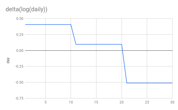
Let’s simulate an epidemic. I’m not going to use an SIR model. I’m just going to simulate exponential growth/decay. 10 days at 1.5x per day, another 10 at 1.1x and finally 10 at 0.6x This simulates steady growth, followed by a weak NPI reducing g from 1.5->1.1 and then a stronger NPI reducing g from 1.1 to 0.6. Whether you think additively or multiplicatively the second NPI is stronger
Here’s are the basic graphs showing daily new cases and cumulative cases. Nothing terribly interesting here although I would point out that the NPIs are far more clearly visible to the human eye on the daily graph than on the cumulative graph.
Now let’s look at log(delta(cumulative)) vs delta(log(cumulative)).
You can see that delta(log(daily)) gives us a flat line during periods of constant growth. This is exactly what we want and perfect for applying linear regression. delta(log(cumulative)) on the other hand gives us… I don’t know what. It’s dropping rapidly, even when cases are still rising! It’s not linear at all despite periods of constant growth. Applying linear regression to this seems unjustified, to put it mildly.
More importantly you can see that the later NPI is very clearly stronger in the delta(log(daily)) graph and applying linear regression will discover that. While in the delta(log(cumulative)) growth, it’s the weaker NPI which appears to have a larger impact!
Finally and most absurdly, if a perfect NPI appears in week 3 and stops transmission dead in its tracks, delta(log(cumulative)) would drop from from 0.2 to 0. So this perfect NPI would still appear less effective than the first 1.5x->1.1x NPI!
This definition of g is fundementally broken.
The authors themselves state that g is bounded by zero. So they know about this. If you look at the graphs in their paper you can see this effect quite clearly, they all head to 0 as time goes on.
Per-country growth from the paper
Contrast this with graphs of estimated R for the 10 countries in the paper.
At the end of the period (around 2020-04-10), UK, US, Sweden and Netherlands all still had positive growth rates but in the paper’s graphs, they are all hanging around close to 0.
This should have been a huge red-flag for the authors that something was up with their methodology.
Further oddness
This paper was published in 2021-01 but only looks at data until 2020-04. The zip file that comes with the paper contains data for cases and NPIs far beyond 2020-04. Why don’t they use more data? Wouldn’t more data give a clearer result? There is no justification given for the stopping point. The nearest is this statement in their reply to letters.
The data that we include cover the period up to the elimination of rapid growth in the first wave.
More data would certainly have made it very obvious that the delta(log(cumulative)) has some very odd behaviour. The graphs of “growth” would have stayed around 0 even as Spain, France and Netherlands headed into new waves.
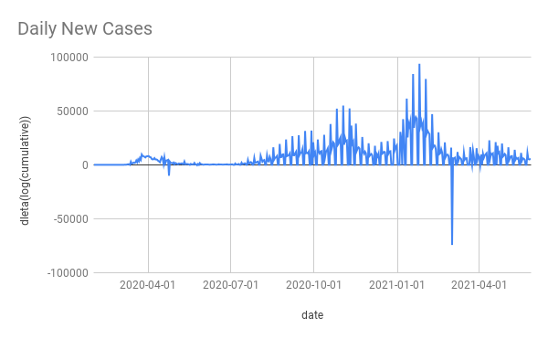
For example here’s Spain’s daily cases and delta(log(cumulative)) (the data comes from the paper’s ZIP file it has some blips and squeaks that I didn’t bother to try clean up).
The massive winter wave is almost invisible with delta(log(cumulative)). As is pretty much everything else except the initial wave. This shows what a non-useful method it is to take delta(log(cumulative)).
Conclusion
When the methodology gets the wrong answer on simulated, perfect, noiseless data, something is wrong. When the methodology is surprising and the surprise is not even mentioned, let-alone justified in the paper or validate on well-understood cases, it’s alarming.
It’s possible I have missed some key point about delta(log(cumulative)) that makes it suitable for use or superior to log(daily). As far as I can see, the only “good” thing about it is that it gets the answer that the authors wanted.
I don’t have access to the software needed to run their code (Stata is expensive and I have no use for it day to day). If I did I would try 2 things
create some fake countries with simulated growth and simulated NPIs and apply the paper’s code to see if it gets the wrong answers
fix their code to measure growth correctly and run it all again to see how the results change. I suspect it would come out quite differently.
As it stands, the conclusions drawn by this paper don’t seem to be justified at all.
Japan’s National Institute for Infectious Diseases published an epidemiological investigation showing long range airborne transmission on a plane. It occurred in Mar 2020. It was published in Oct 2020, in Japanese only. Google translate makes it pretty readable.
Main takeaways:
started off following the “2 row rule” but after finding a bunch of infections near the index case they expanded and expanded and eventually tested 122 out of 141 passengers.
found 14 PCR positive passengers.
found several others with symptoms who they did not test.
confirmed that all positives were an RNA match for the index case.
it travelled far - furthest infection was 16 rows in front of index case with another 4 infections 9 rows in front and one 6 rows behind. Also, some of the symptomatic, untested people were far from the index case.
index case had a severe cough but did not wear a mask
I have translated the seating diagram published in the report from Japanese to English. I don’t know why there are 2 “3rd tests”, that was in the original Japanese.
Seating diagram of flight with test results etc
In the discussion they mention droplet and “マイクロ飛沫感染” - micro-droplet - infection in-flight. They also say that they didn’t have aircondtioning and ventilation information or pre-boarding passenger interaction information.
I often hear that “Japan understood this was airborne from the start” and it’s half true - some scientists here knew and the “3 Cs” guidance has been good but a lot of the response has been focused on droplets and fomites, cleaning and perpex barriers.
All of the information in this report was available in March 2020. It’s really disappointing that this was not published sooner and more broadly as it seems like it would have been strong evidence for airborne spread and also strong evidence against the safety of air travel. Especially given the full RNA analysis and almost complete test coverage os passengers
I keep hearing that the spread of SARS2 in Japan recently has been exceptional and variants are a problem etc. That's kind-of unclear. The week-on-week growth rate for Tokyo has not gone above 1.3x [1]. The national growth rate is similar [2].
Last April we saw up to 3x growth week-on-week. Obviously they were different times but Tokyo also saw some 1.5x weekly growth back in Nov too.
It's possible that if we didn't have the SOE-lite (State of Emergency) for the last 2 weeks things would be worse but it's hard to know if that has had any impact at all.
What is new is that the last SOE ended long before hospitals emptied out. I don't have Tokyo's numbers but nationally ICU usage peaked at 1043 on 2021-01-27 and was only down to 631 on 2021-03-21 when the last SOE ended (cases were at 300/day in Tokyo).
I think we're entering SOE again a month later not because the variants are crazy but because ICU beds were still 60-70% full when we allowed the growth to restart and there was lots of virus around.
Maybe PM Suga really believed that after lifting the SOE in March cases would keep falling. That makes no sense to me. He's talking about lifting this SOE after 2 weeks. Good luck with that. It's a stronger SOE, so cases will drop faster but hospitals empty out quite slowly, there's not a lot he can do about that.
I got in a twitter argument with someone about COVID19 and they threw a surprising stat at me. South Korea had over 20k excess deaths this year. This made no sense to me. SK is maniacal about testing, their official COVID19 death toll for 2020 was 917. Did they miss 20x that many? Was there some other big killer? Is it a statistical blip? The answer is "none of the above".
The source was this WSJ article. It's pay-walled but the key information is this info-graphic which purports to show that many countries have vast quantities of excess death, above their official COVID numbers.
So the world has massively under-counted COVID19 deaths? Probably but the other key information is how they calculated excess deaths
Methodology: To analyze the pandemic’s toll, the Journal compiled weekly or monthly death data for 2020 and for 2015-19, where available. Most of the data was collected from national statistical agencies, either directly or indirectly through inter-governmental or academic groups. In a handful of nations, data was collected by health data organizations or local analysts. Epidemiologists use several methods to calculate excess deaths, adjusting for age composition, incomplete data and other factors. The Journal used a straightforward method, summing deaths for the portion of 2020 available and subtracting from that total the average number of deaths that occurred in the same span of each year from 2015-19. When the result falls below zero—when the 2020 death total fell below the average—some countries adjust the result to zero, boosting excess death totals. The Journal did not adjust in those cases. All totals are based on actual counts and comparisons. For some nations, the average was based on three or four recent years, typically 2016-19.
I have bolded the important part.
Unfortunately this straight-forward method is a fundamentally flawed methodology (did they not talk to an epidemiologist before publishing?). It ignores the fact that most countries have underlying mortality trends due to their demographics. Using their methodology South Korea has +24k excess death in 2020 but guess what, it had +21k excess death in 2019! This is what SK's recent excess deaths look like with WSJ's methodology. Here is the sheet if you want to explore.
As you can see, SK's mortality is rising pretty rapidly, presumably due to a population explosion in the 50s and 60s. I believe most countries are similar. This makes all of the numbers in the article somewhere between questionable and meaningless.
Applying their methodology to the whole world, we get an excess of 1.7M in 2020 and 1.3M in 2019. They did a subset of the world and got 2.8M which is also interesting, I don't know where that discrepancy comes from.
So while the world has surely under-counted official COVID death, WSJ's figures could almost be anything, an over-count or an under-count. What's bizarre is that they said "Epidemiologists use several methods to calculate excess deaths, adjusting for age composition, incomplete data and other factors" and then proceeded to just do it wrong anyway.
Addendum: New Zealand is quite similar. Here's the data
TL;DR The Japan Choral Association have given themselves the all-clear to continue singing by producing a scientific report that focuses on splashes and pretends that COVID19 is not airborne.
CBS reports that the Japan Choral Association has been involved in research on the production of splashes/droplets during singing. They measured droplets singing in 3 languages, German, Italian and Japanese. German produced the most, Japanese the least (the song apparently is a fairly aggressive kids' song).
It's awful because they chose not to measure aerosols. Despite knowing form early on that this was airborne (the 3Cs are precautions for airborne spread), many people in Japan remain super-focused on droplets (I had a nurse friend explain to me how 1 patient infected the 3 others in his room because they all used the same toilet, also the recent Oedo-line dorm faucet event).
There's a bit at the end where it says that it's not yet clear what size droplets are carrying the infection but that most important is thought to be large droplets. If this was true then ventilation would not matter. Non-droplet airborne infection has been demonstrated in the labs between animals. Also in www.superspreadingdatabase.com there is just 1 outdoor event out of 2000+, droplets exist indoor and outdoor, aerosols only accumulate indoors. The many choral (and other) super-spreader events cannot be explained by droplets, with people being infected many meters from the index case.
The safeguards they have developed for singing, spacing and patterning entirely assume droplet transmission.